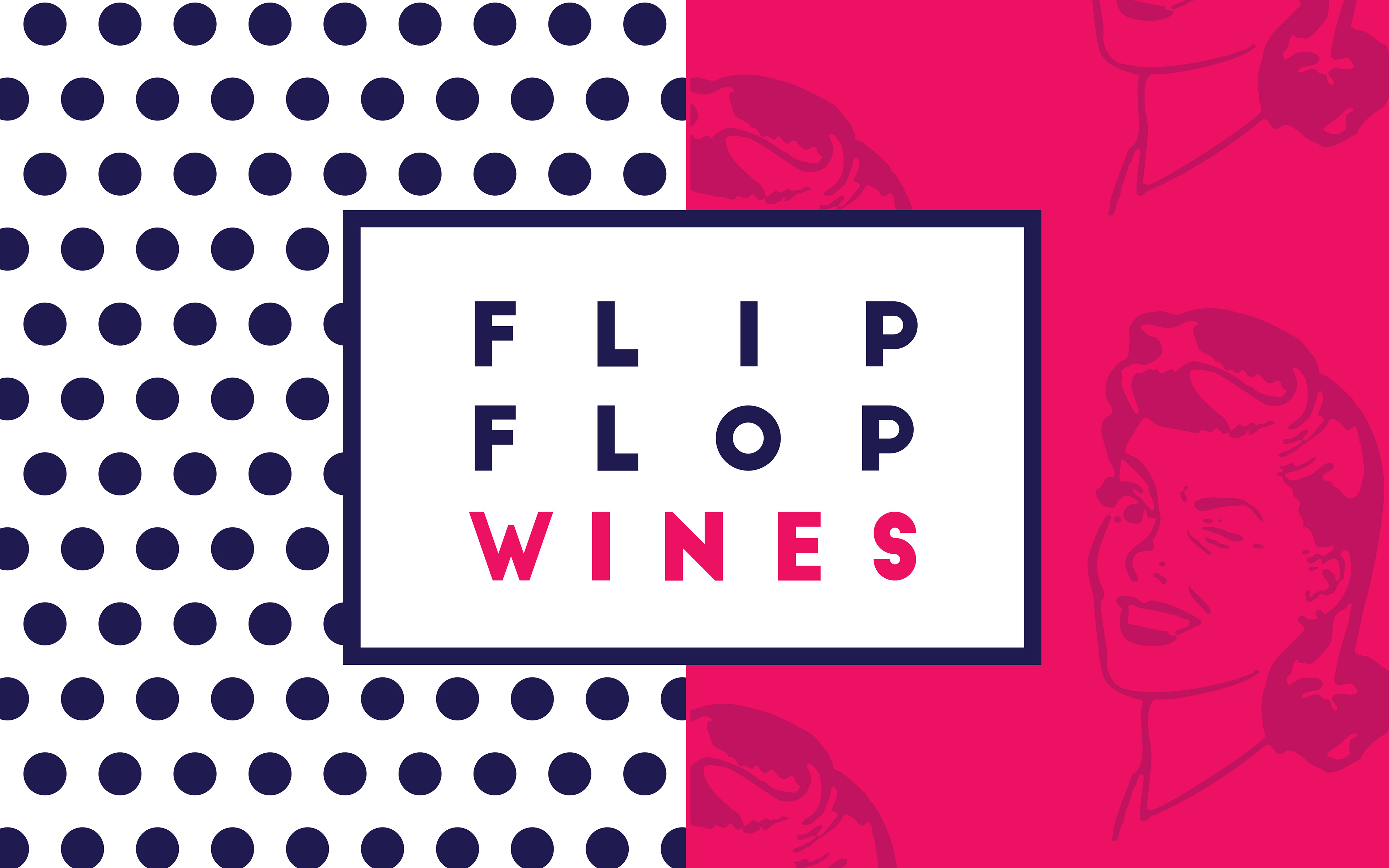
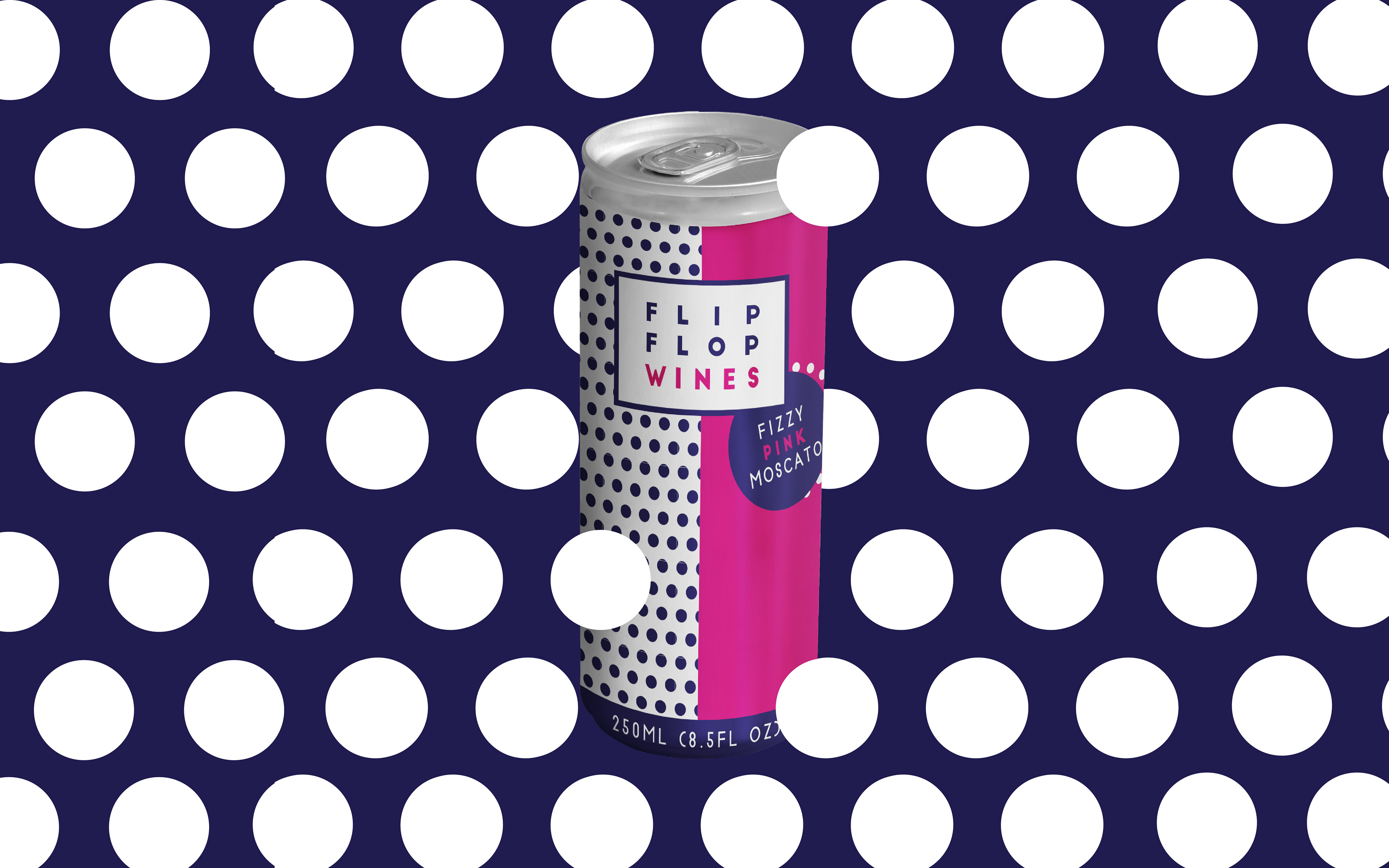
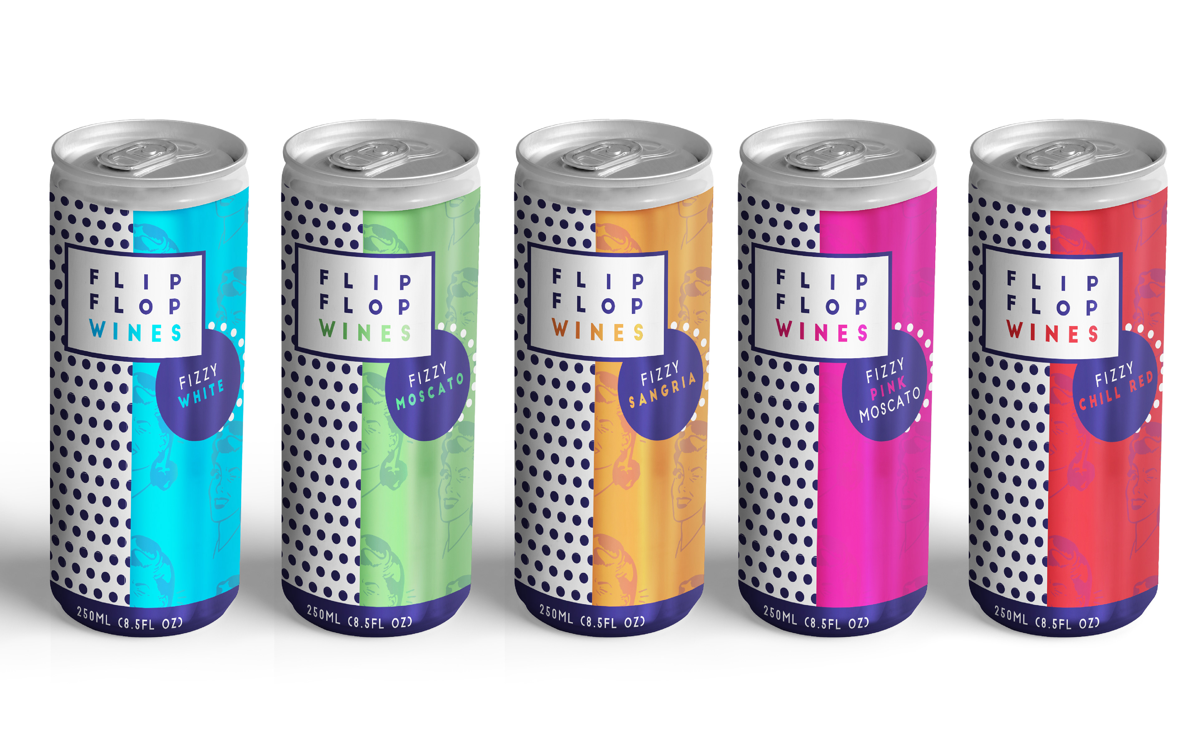
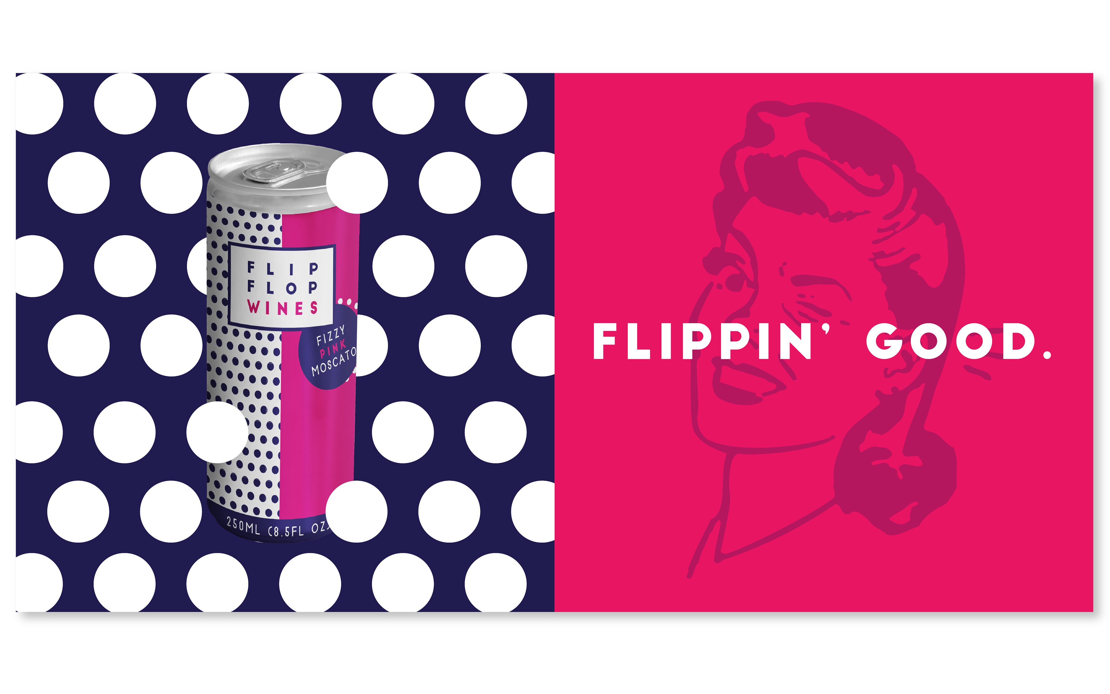
When it comes to my personal work, one of my favorite types of projects are redesigns. I have always been interested in how good design can elevate a product or brand. In this case, I chose to rethink the branding for Flip Flop Wines, a carbonated wine beverage that comes in small 8.5 ounce cans. The product itself is unique, and with the right brand, I felt it could be youthful and fun, hopefully appealing to a broader market. As you will see below, my rebrand for Flip Flop Wines consists of five can designs, and multiple panels that could be used for social media marketing and advertising, such as billboards.
I am inspired by different art movements throughout history, and for this particular project I chose to draw from the pop art movement. This meant including pops of bright color, geometric shapes and typefaces, and even the winking housewife imagery. The dots that are incorporated into the packaging and marketing materials both mimic halftone patterns that were so popular in pop art, and the carbonation of the drink itself. All in all, my hope for this design was to create something that would stand out on the shelf, compelling you to choose Flip Flop over other comparable products.