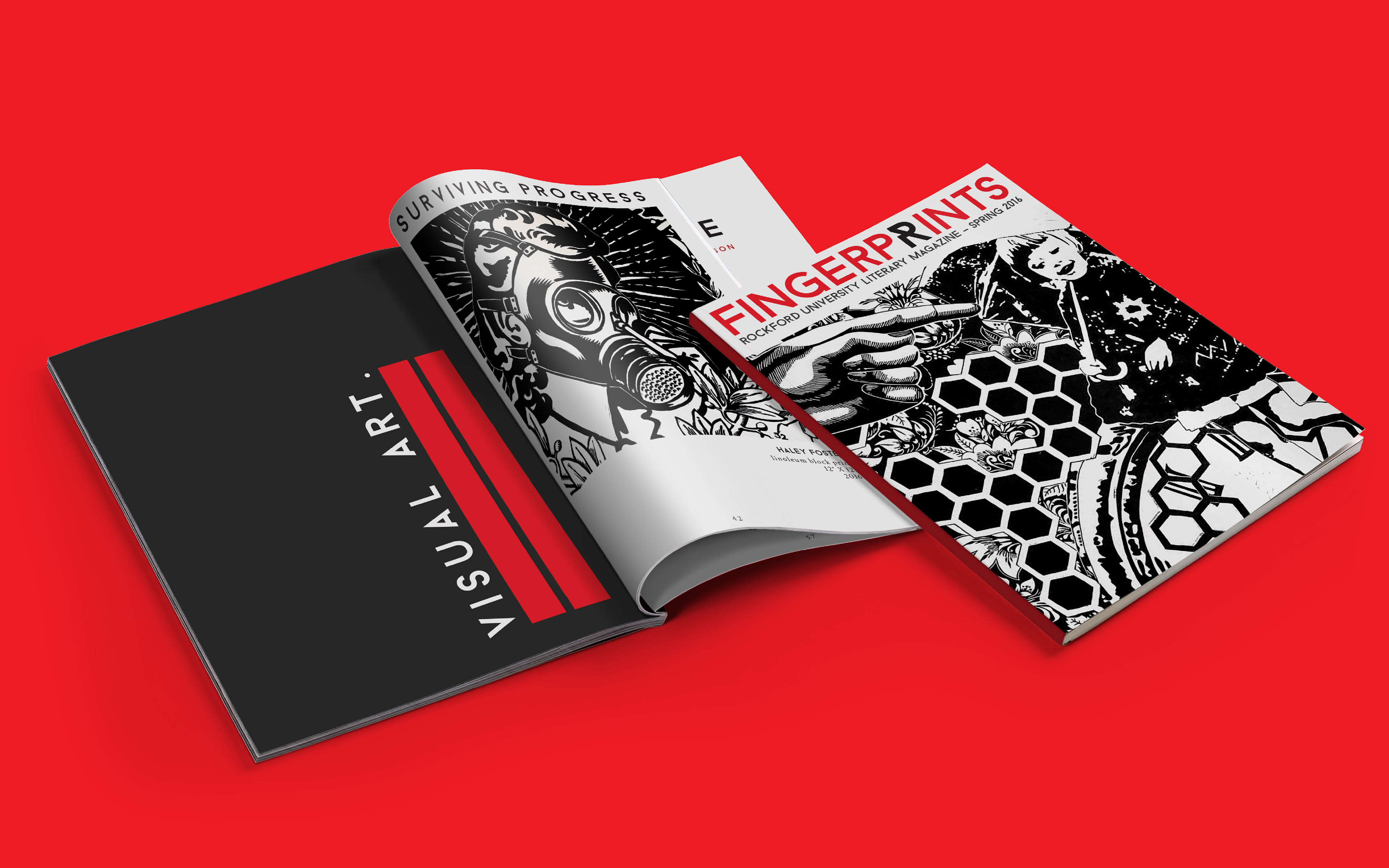
As designers, we are so often prone to working alone. But when it came to Fingerprints, the Rockford University literary magazine, I had the chance to collaborate with a very talented group of other student designers - and I believe that this project is better for it.
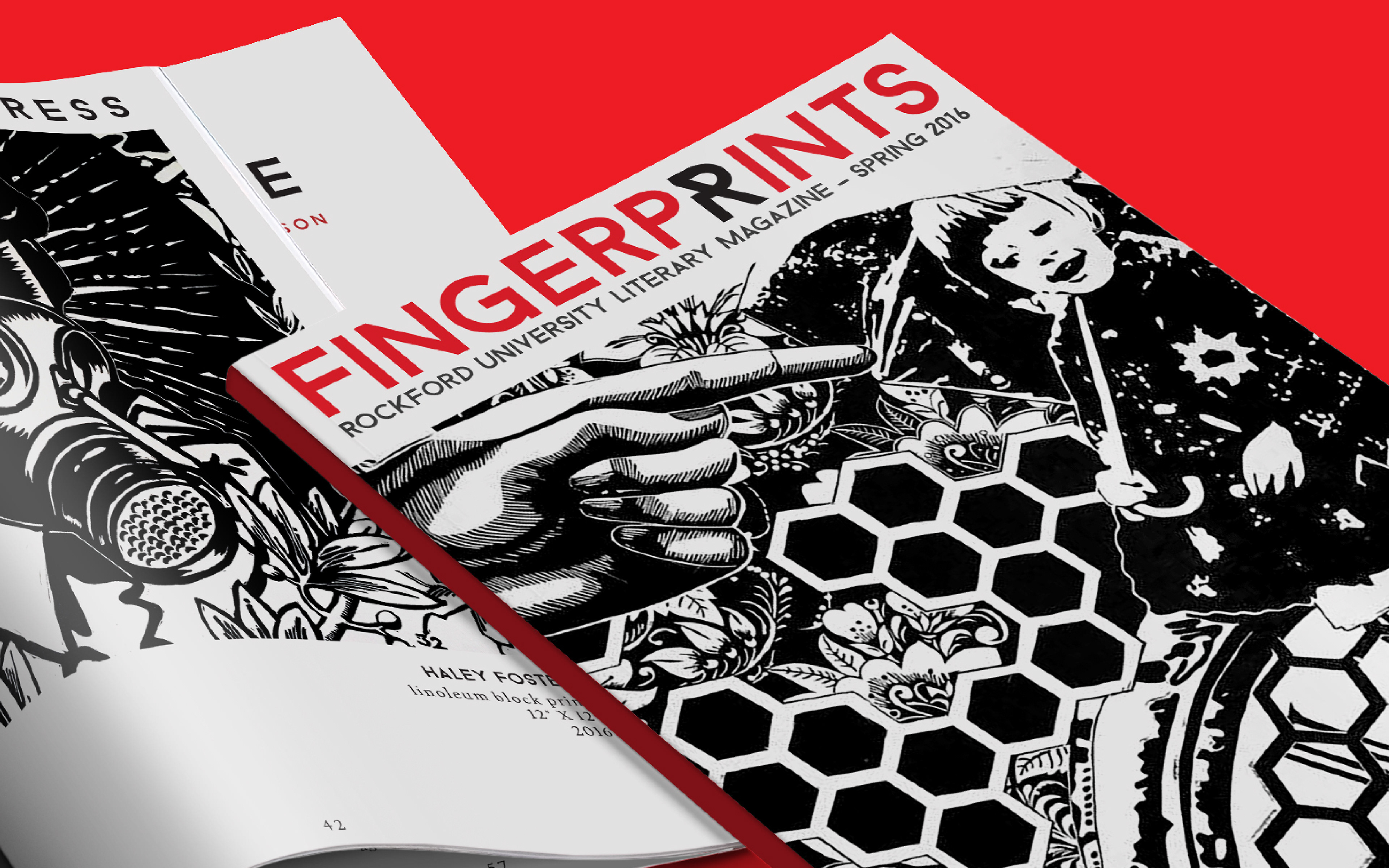
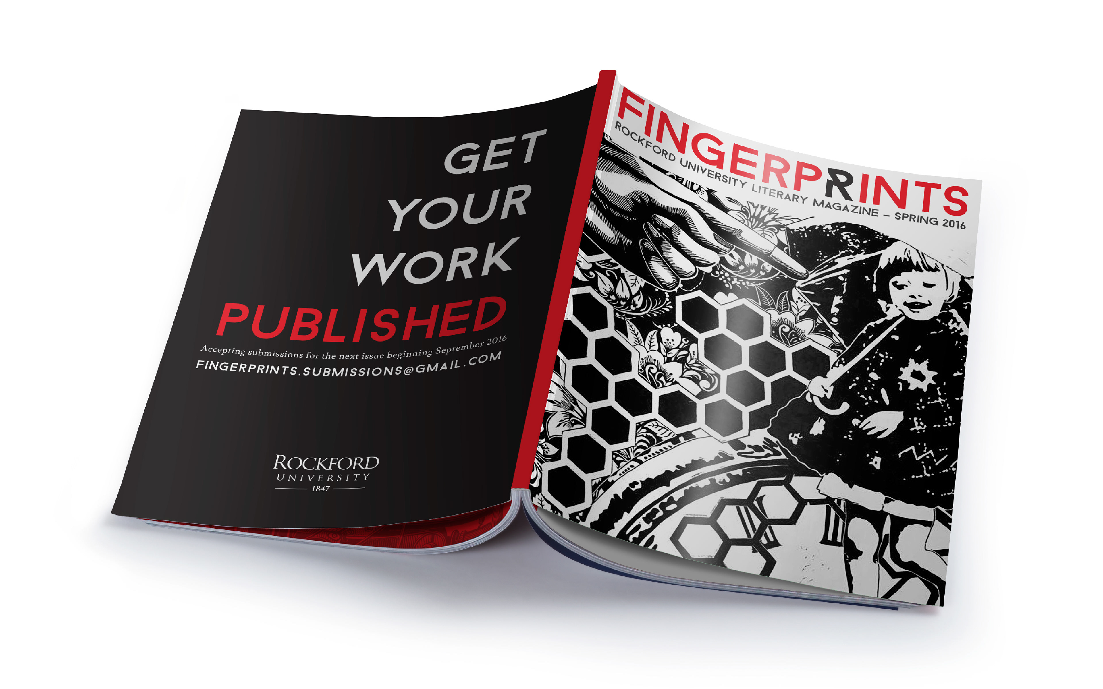
The name "Fingerprints" itself was intended to well-represent the varied work of majors from all over the Rockford University campus. With that being said, one of the group's greatest goals in creating this magazine was to design a piece that was not only functional for displaying the work, but also compelling enough to convince readers to pick up a copy and page through it.
To do so, design tasks were distributed to different members of the group. After establishing a cohesive set of brand standards, including the typography and color palette, the first group was tasked with the layout of a complex grid that would allow every page in the magazine to look great individually and together as a whole. Next, a group worked for weeks inputting content on each page.
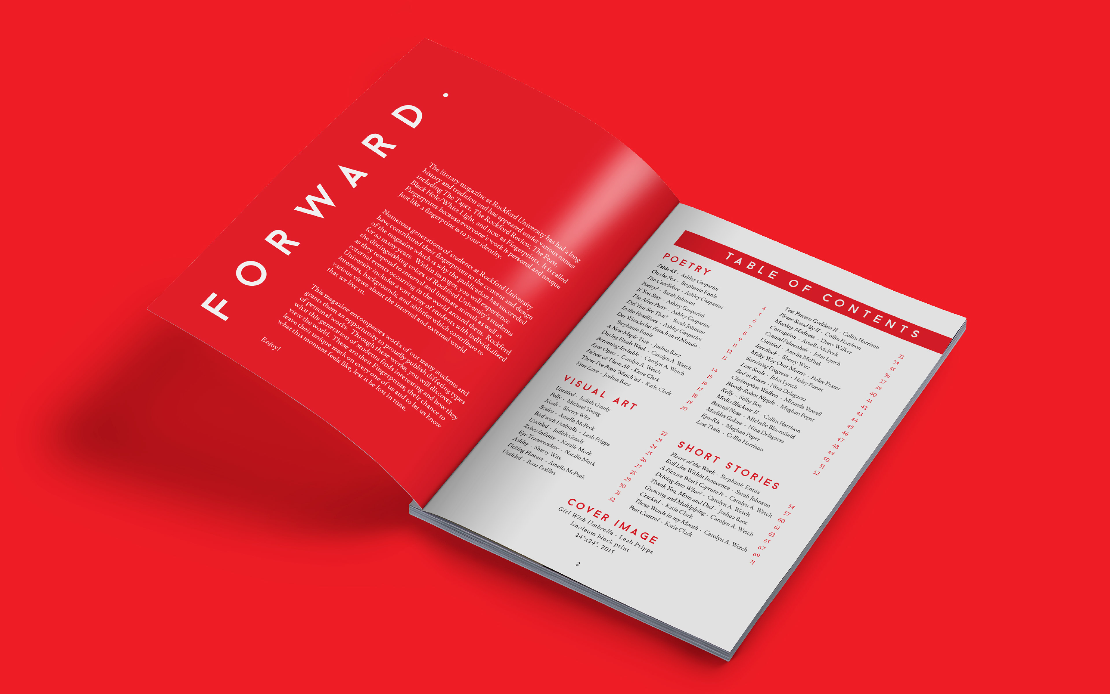
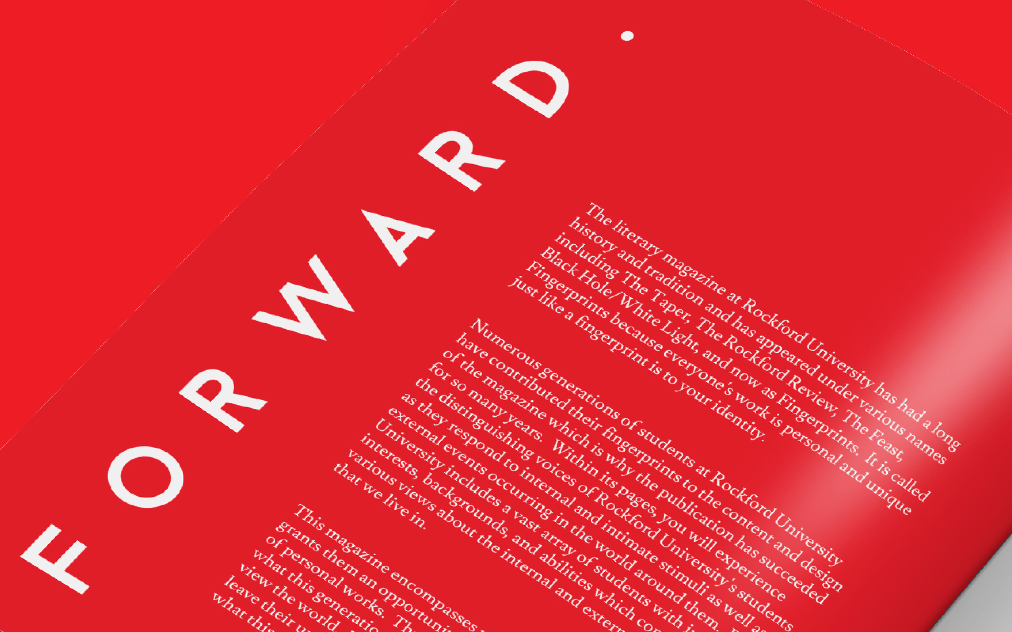
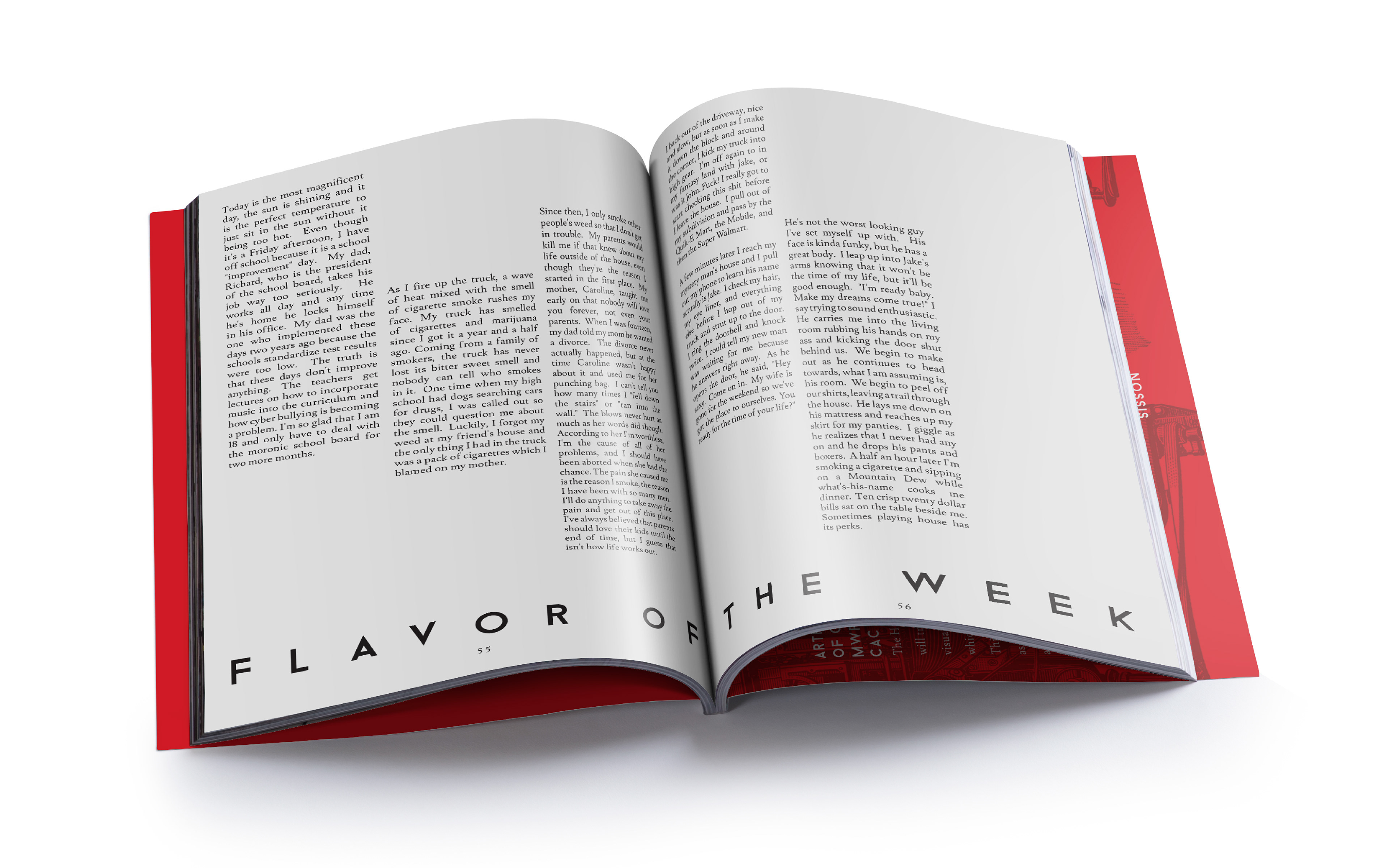
The last pair of eyes and hands to touch the magazine was my own. Aside from proofreading, art directing, and finishing up whatever work was not completed by the previous groups, my biggest task was the design of the magazine's front and back covers, forward, table of contents, and a handful of short story page spreads.