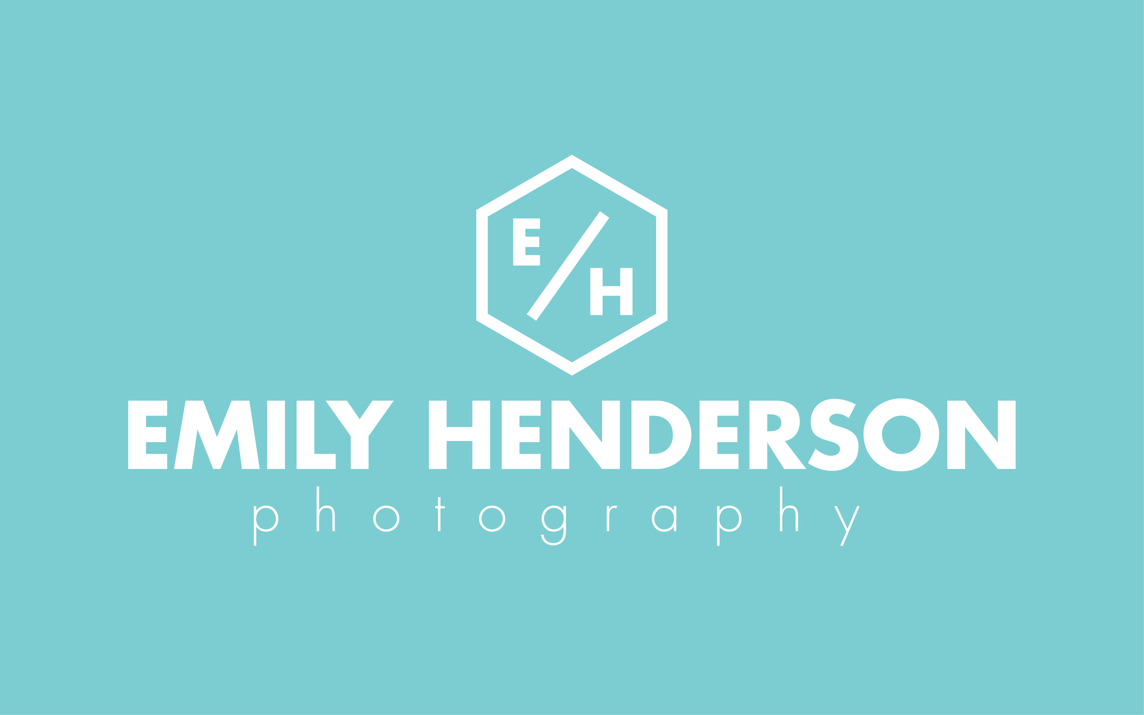
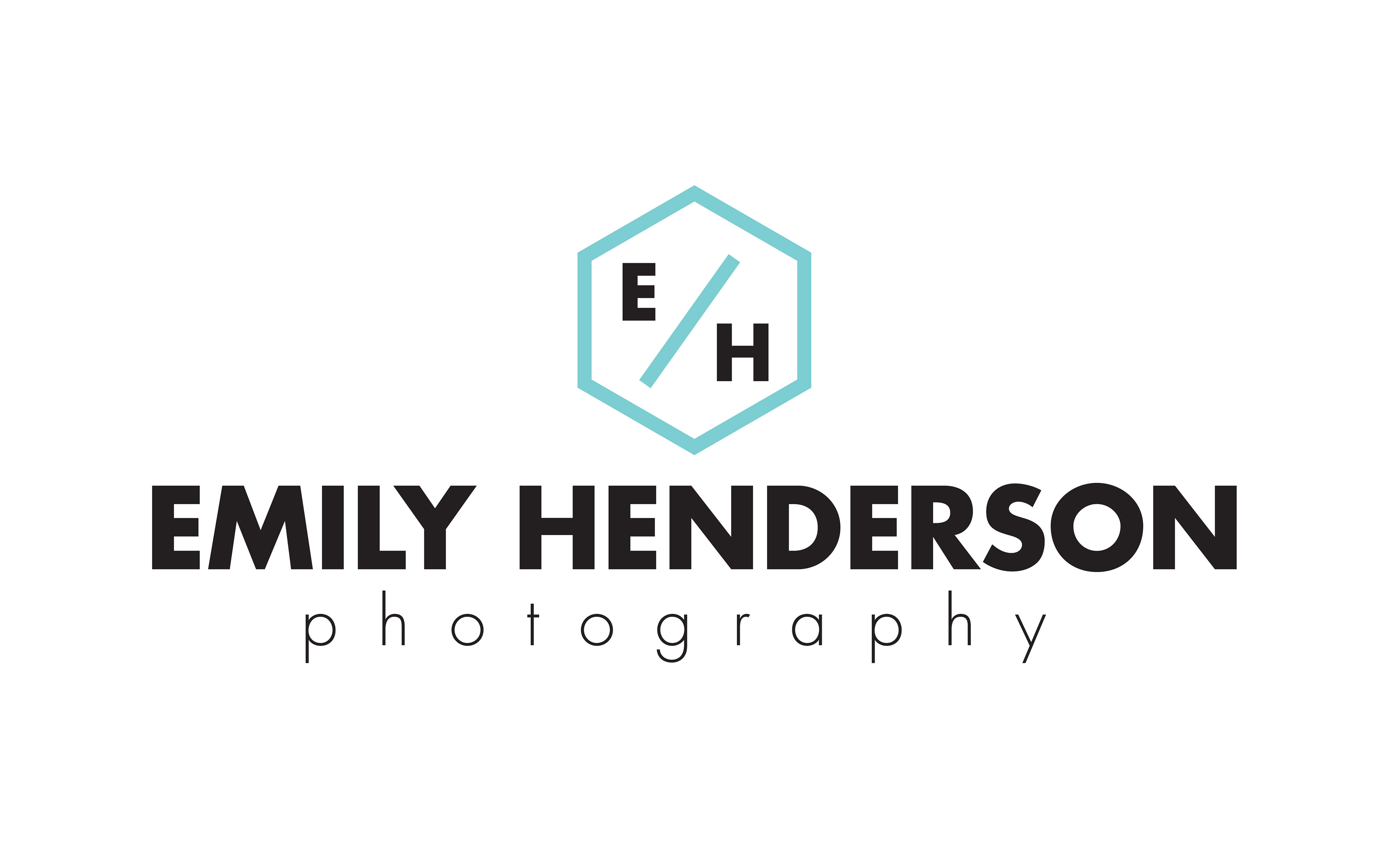
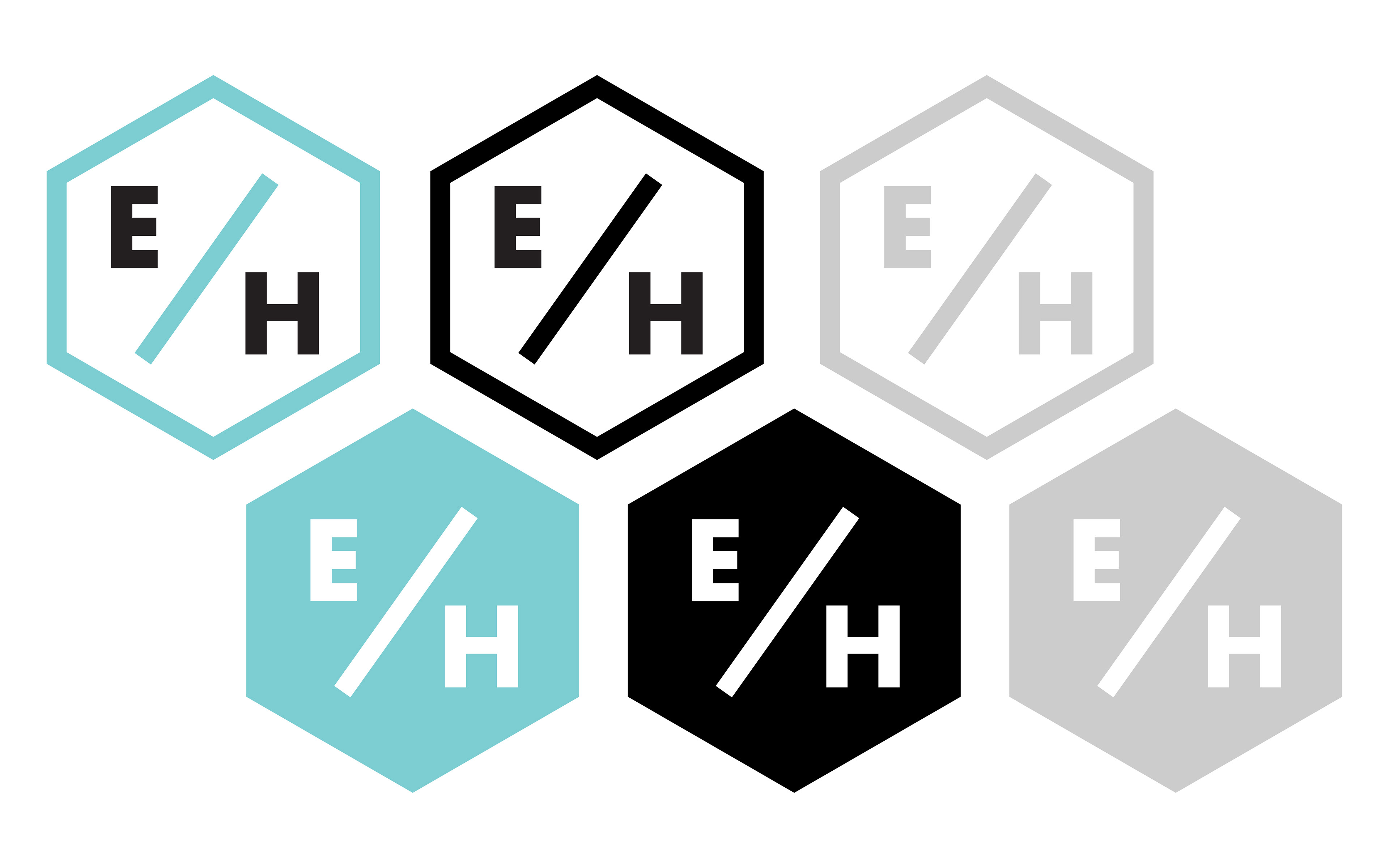
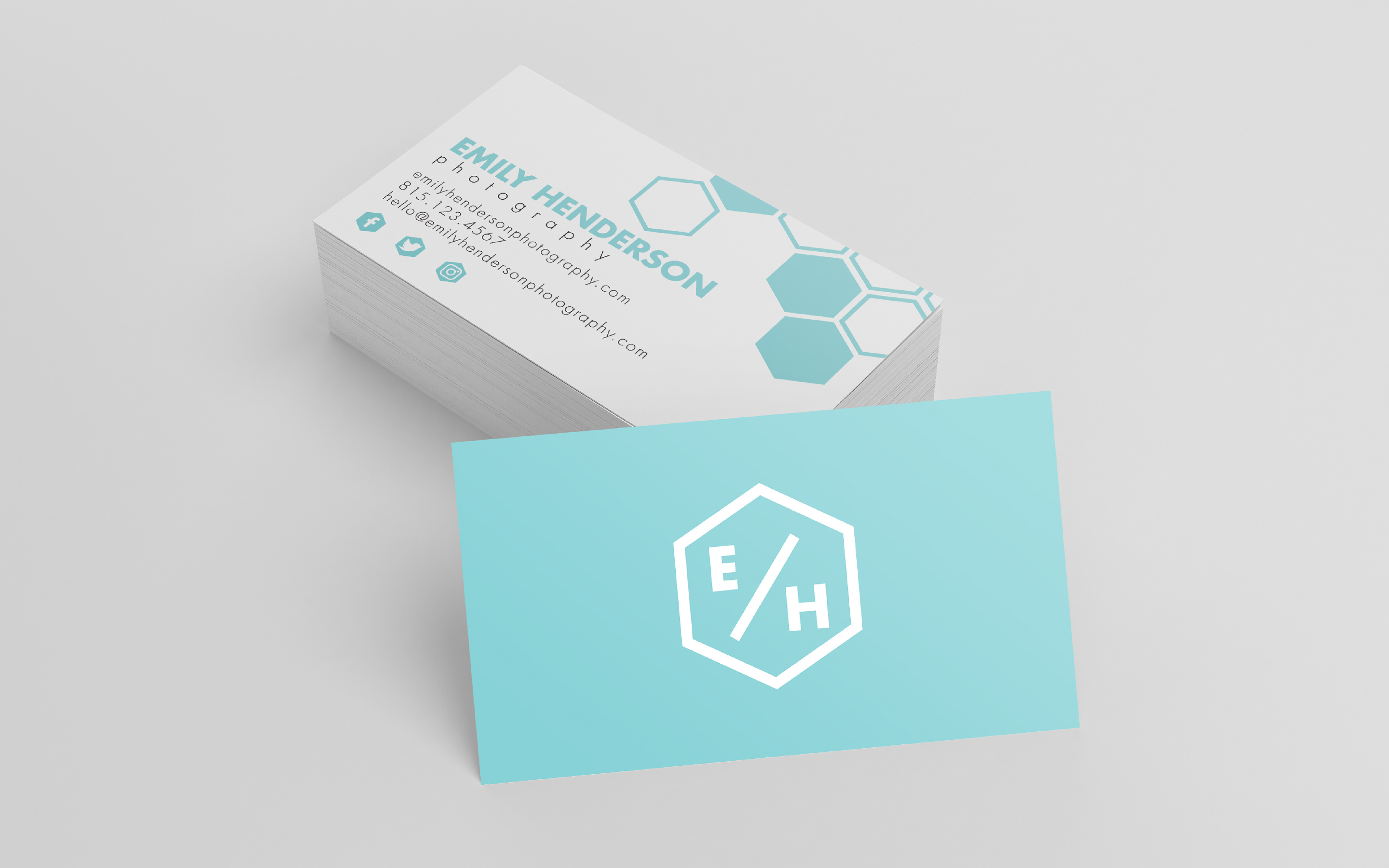
It is truly a privilege to be trusted with every design project that comes my way, but designing for a friend is always even closer to my heart! For this project, another talented photographer reached out to me in hopes of a brand new look for her growing brand, and we settled on something sleek and modern with a bold pop of color. One of my favorite aspects of this brand identity is the use of the hexagon that surrounds Emily's initials. Because her goal is to make connections with other entrepreneurs and small business owners through her photography, I chose a shape that would symbolize that necessity of connection; and so, I settled on the idea of the honeycomb. Another parallel I hoped to draw was that of an old-style camera shutter, with it's geometric shape.