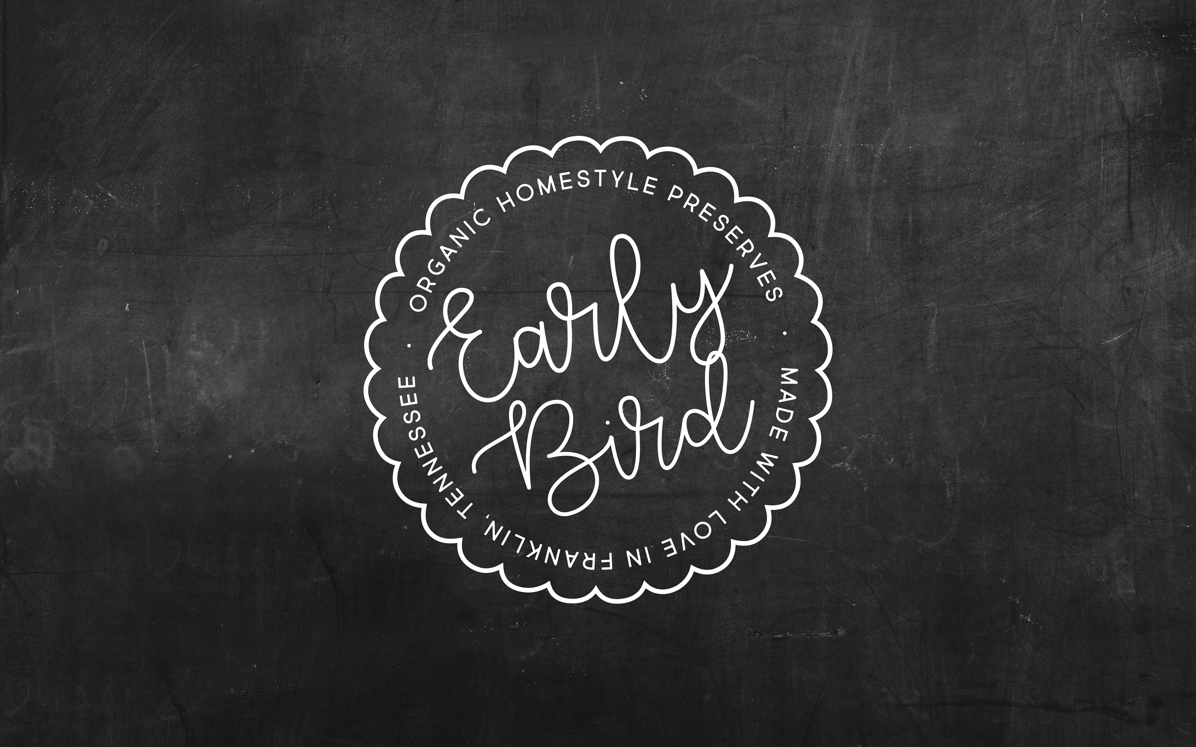
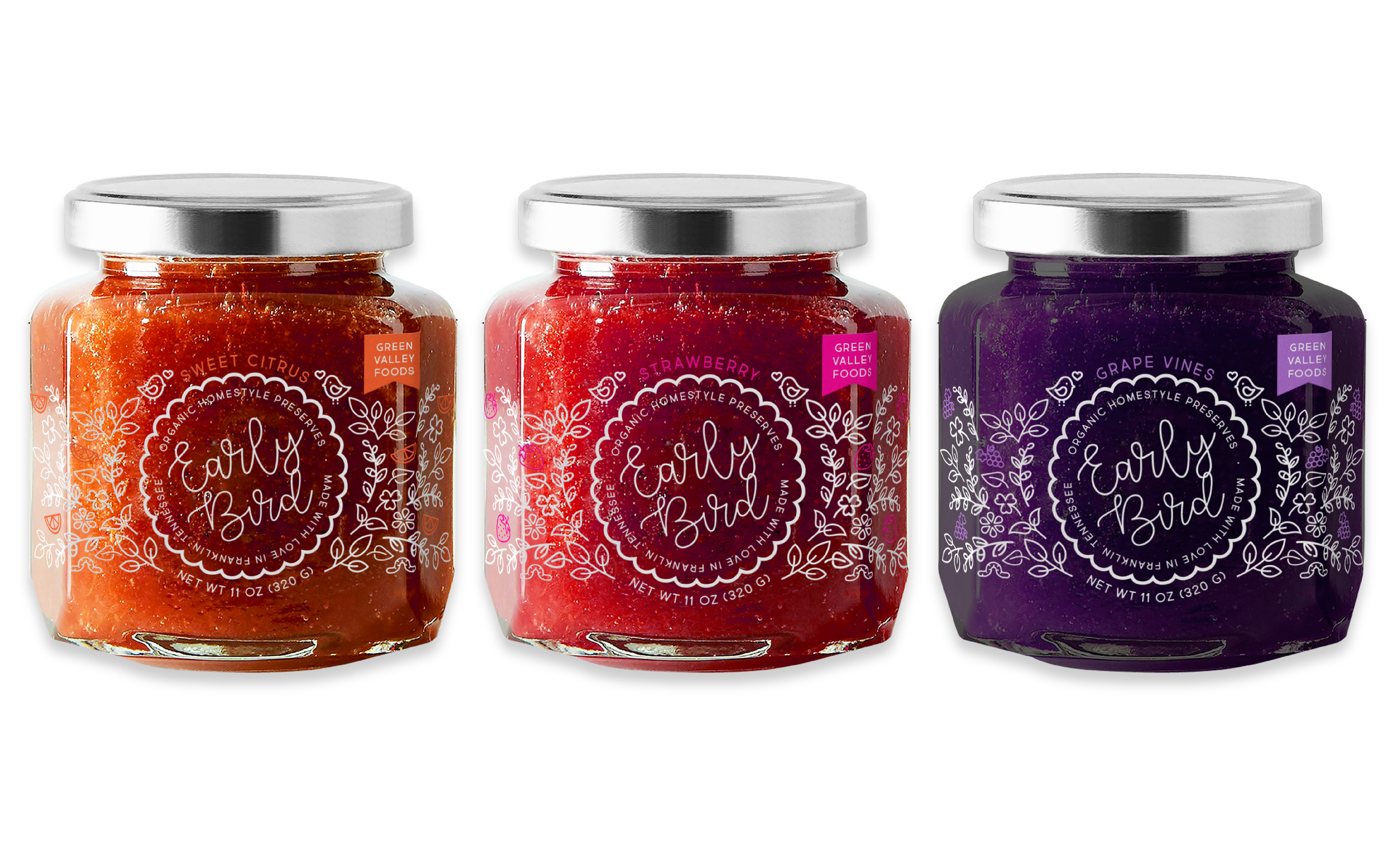
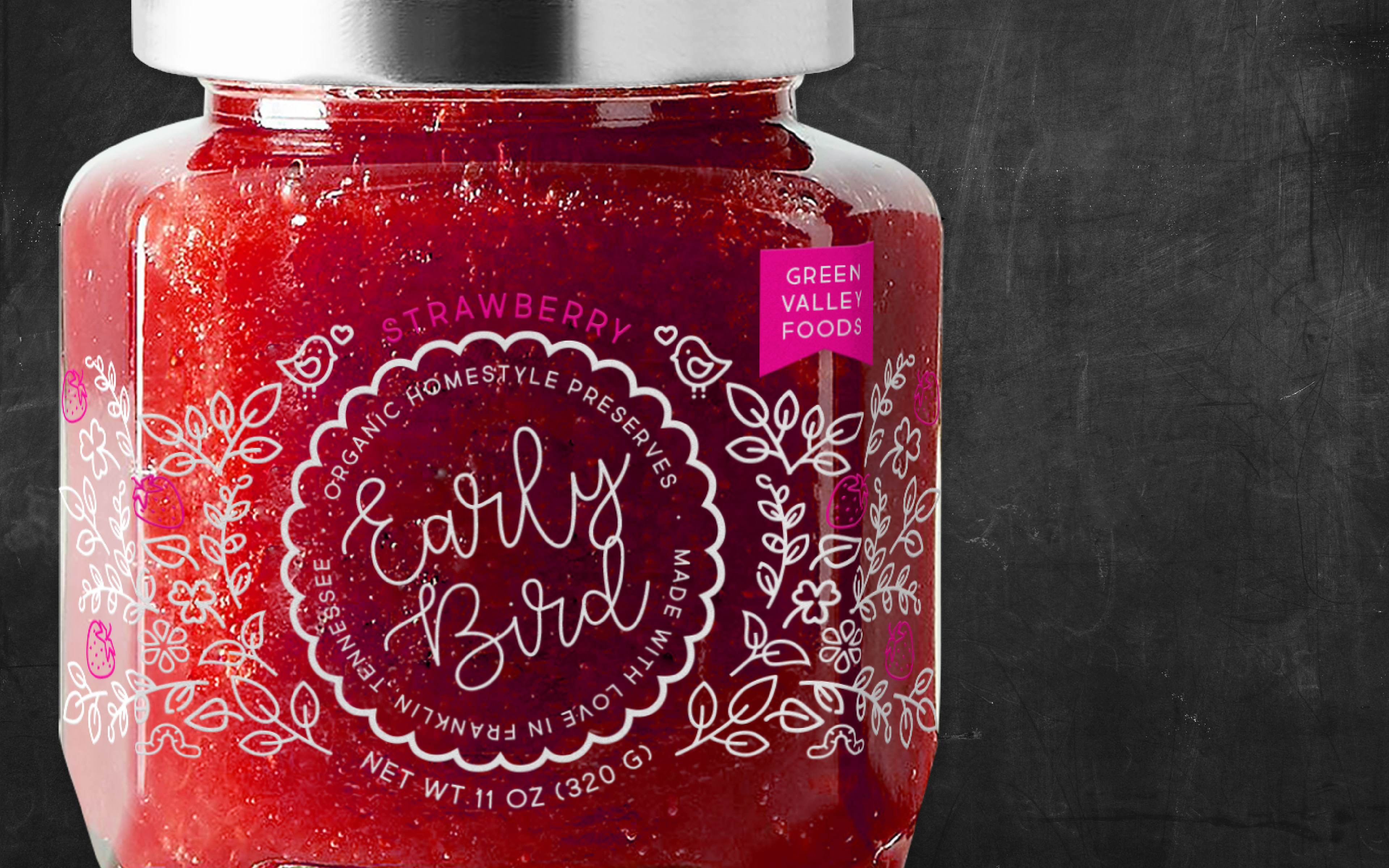
My hope in designing Early Bird Preserves was to create a modern brand that would stand apart from its competition while still giving off a homestyle, organic vibe. I absolutely love working with typography to creates these tones, but for this specific project, I also decided to rely on simple vector illustrations to keep the product lighthearted and fun. Although my initial designs included plenty of color, I eventually chose to create transparent labels or etched glass labels to allow the majority of the color to come from the content of the jar itself. This way, even when the jars are empty, they are still beautiful enough to keep and hopefully recycle.
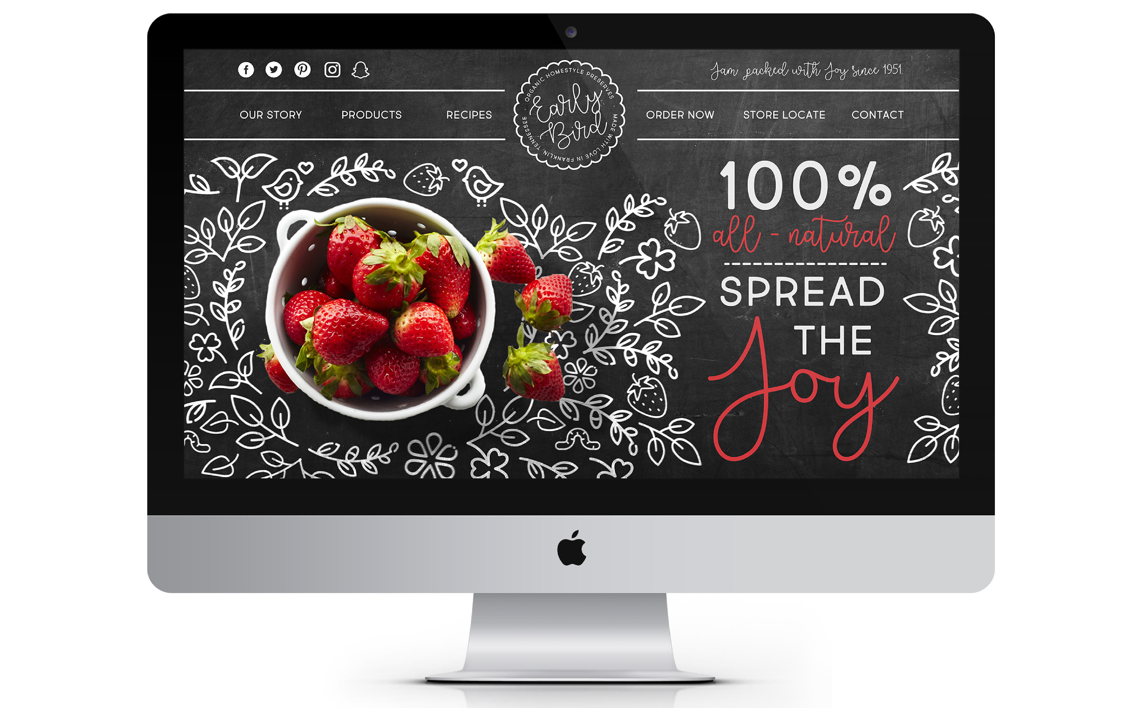
My final step in this project was creating a cohesive website that still aligned with the branding of the jars. My solution for this was to again incorporate the illustrations, but this time pair them with photographs of the fresh ingredients used in the product itself.