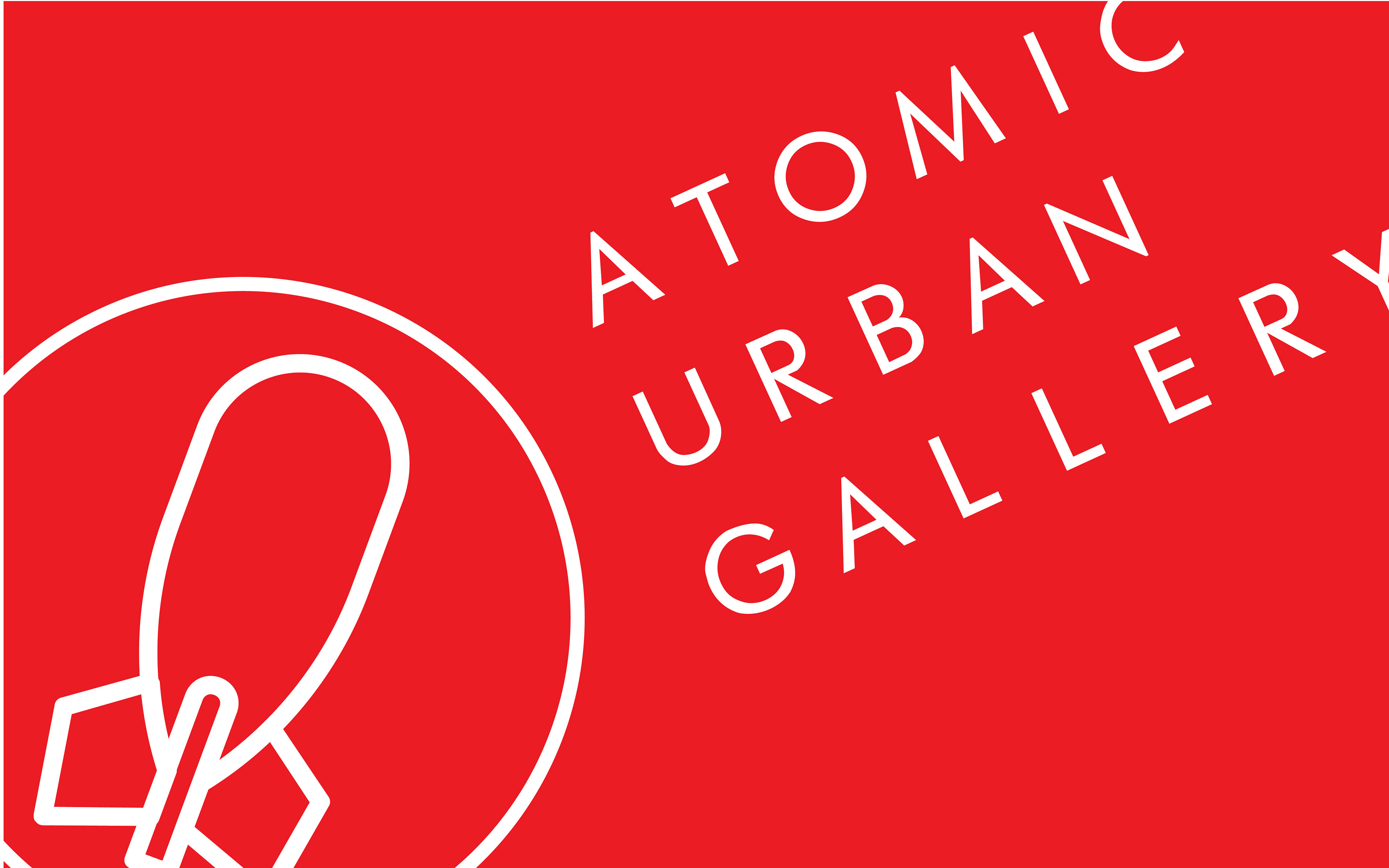
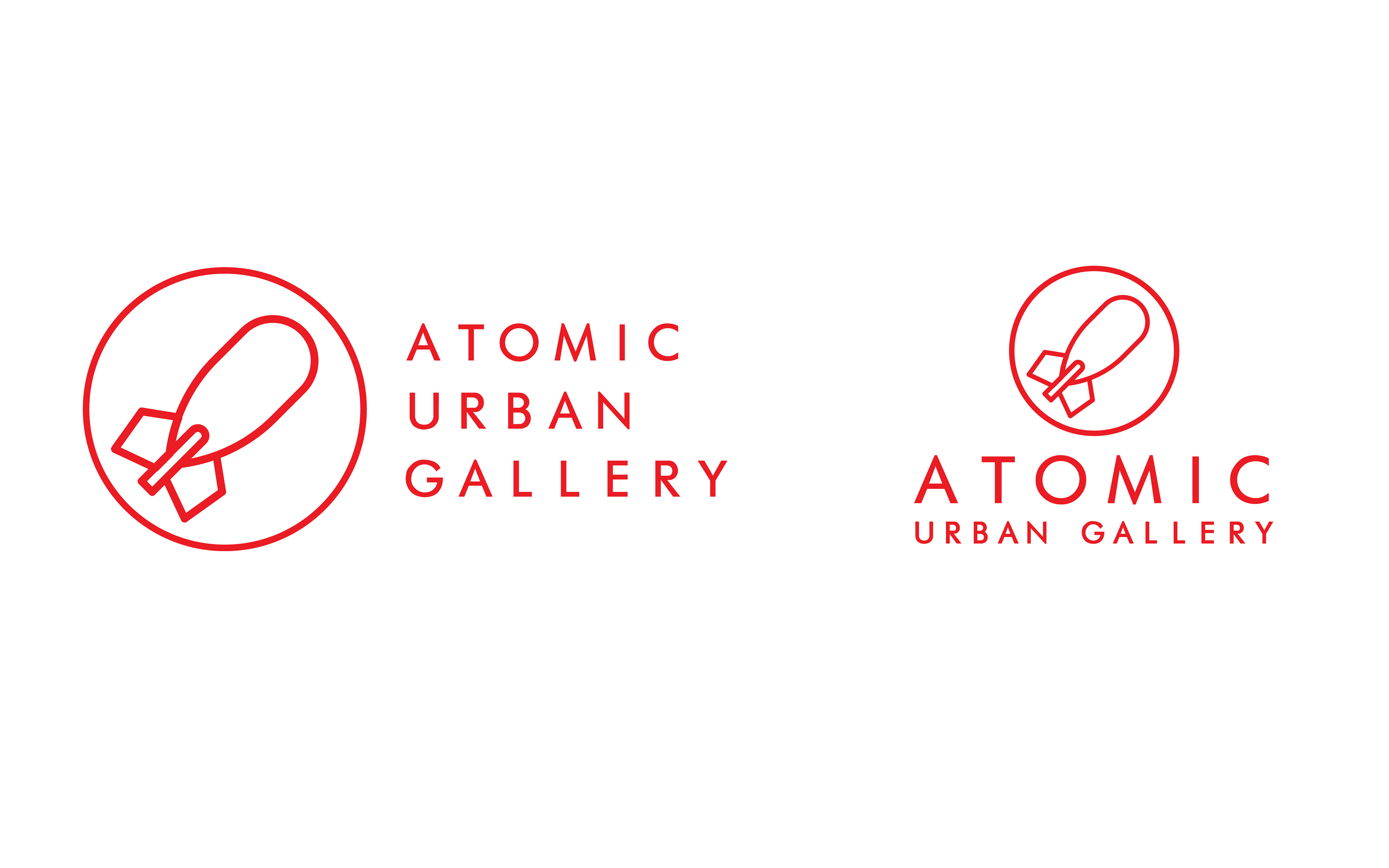
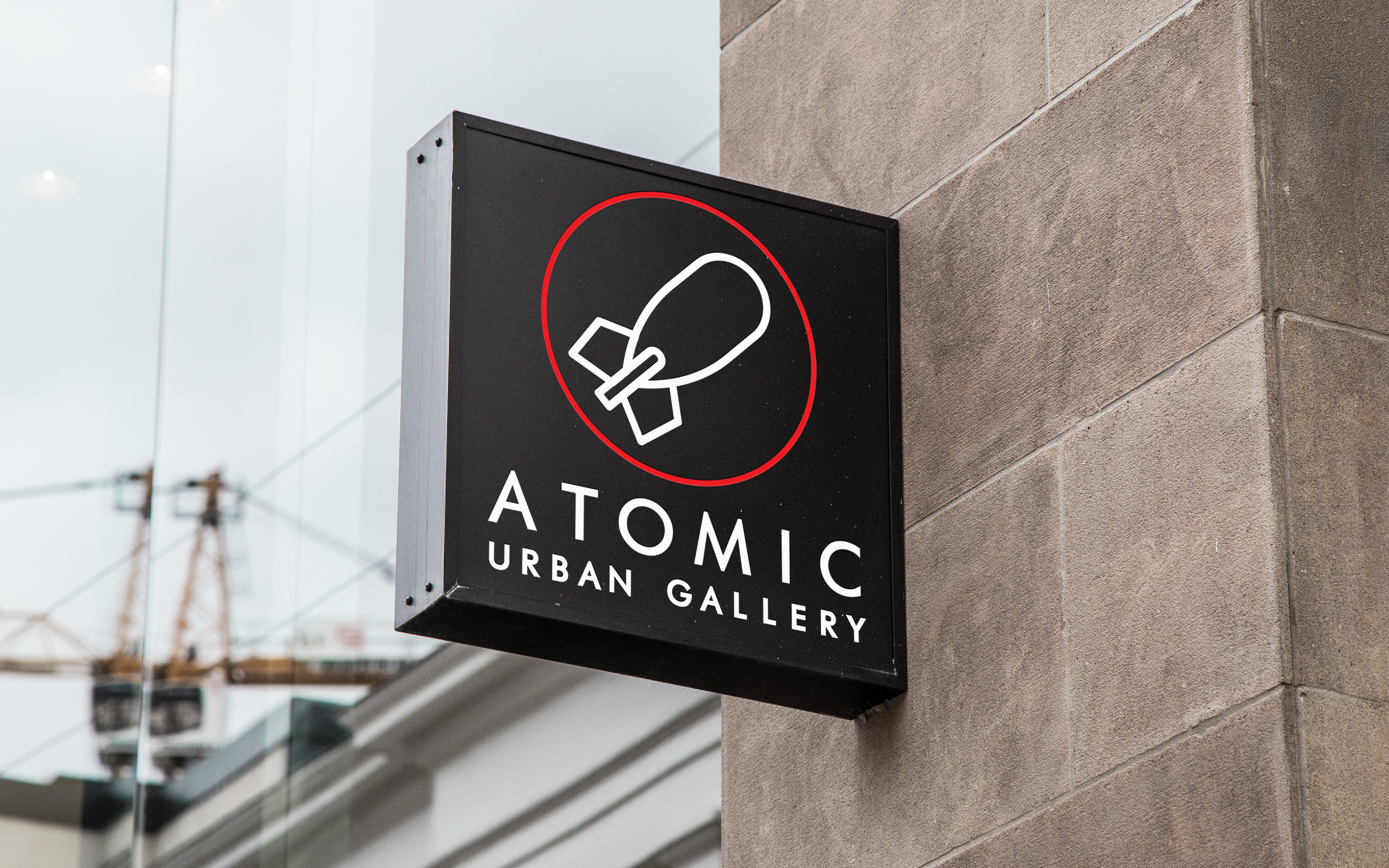
The idea for Atomic came about while I was taking a History of Street Art class in the Fall of 2016. I'd spent all semester learning about the evolution of street art, different artists and styles, and there was something so appealing about the urban quality of the art itself. And so, I challenged myself to brand a gallery that would fit right into any downtown art scene, all the while appealing to less traditional artists and also paying tribute to the history of street art itself (for any of you art history nerds out there, you might recognize the missile logomark and the gallery name itself as a reference to the practice of "bombing" in graffiti).
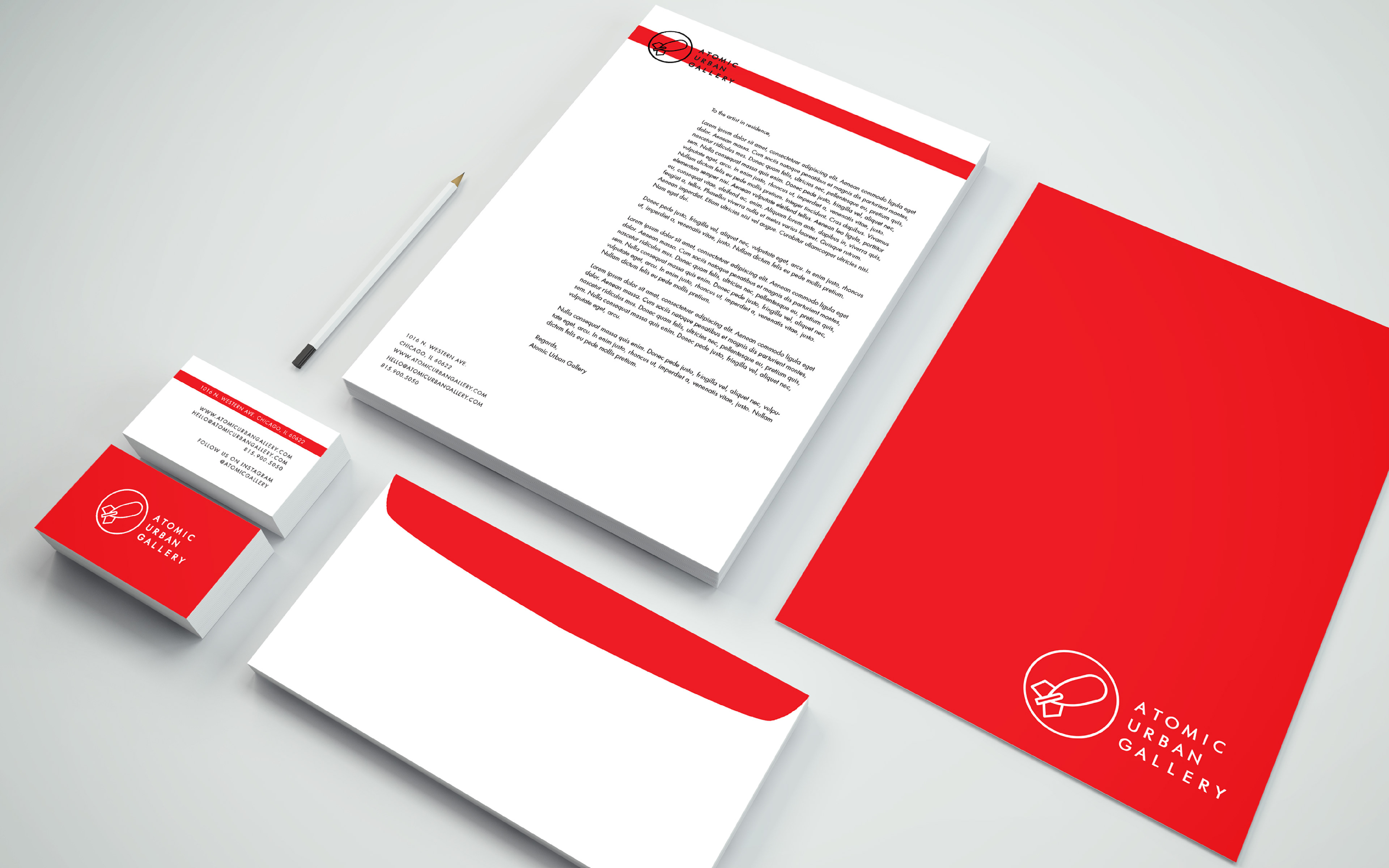
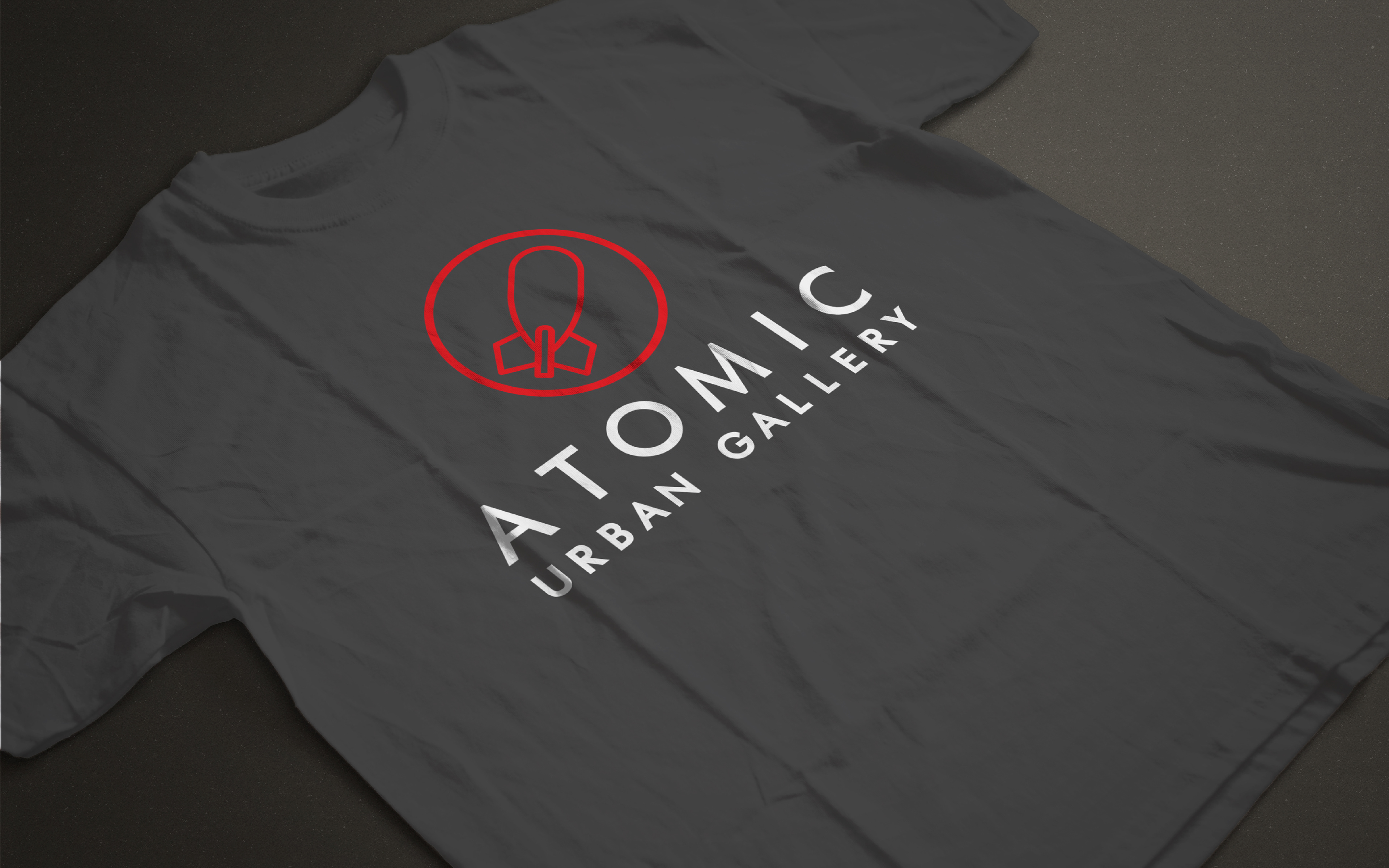
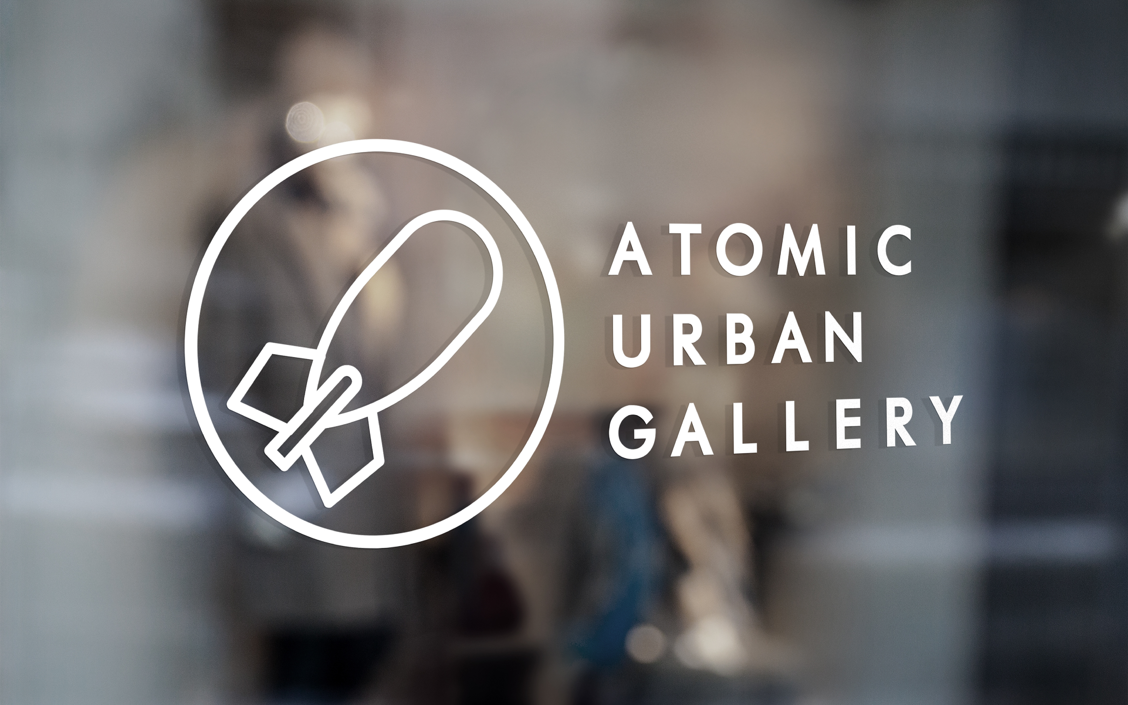
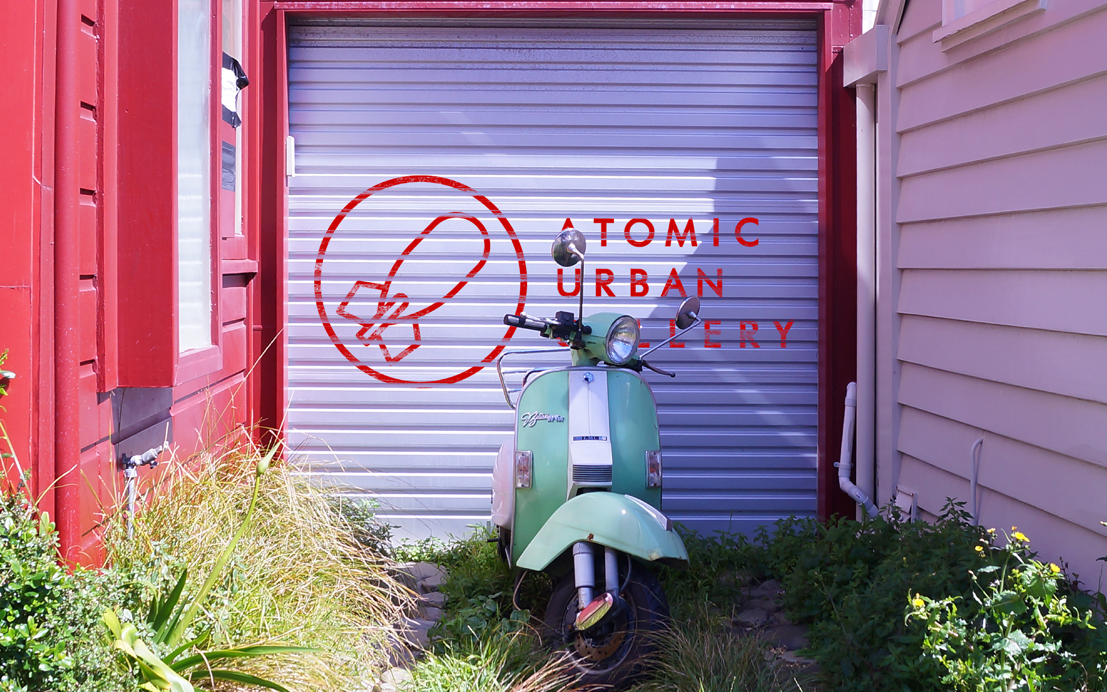
My solution was a sharp, clean logo with just a hint of 1950's style. Paired with a pop of vibrant red, the branding is bold and colorful, yet still neutral enough to draw in artists of all backgrounds and styles who might be represented by Atomic Urban Gallery. Aside from the branding, the gallery itself is intended as a blank canvas for any artist-in-residence to fill with their work, transforming the space into their own personal streets.